This task was aimed to help me with the progression of my project and was based on working in pairs.
For this task I had to explain my initial idea of my project and had to list
my initial photographers/artists that i have looked into as reference points. I was then asked to research and develop this project for my research partner. We had to arrange a meeting with each other ideally on Monday the 21st February or Tuesday the 22nd February, to present and discuss our research and developed projects.
In the meeting I had to highlight my initial research, interrogating the work of
other photographers/artists that have engaged with similar or identical concepts. I used the computers available in the department and my own to conduct my research, but also used the library and its books and photography magazines to further my research remit.
I had to present a clear plan/structure of how i would aim to achieve the project. I talked about how I would intend to visually translate the concept into a cohesive visual project and how I would organize myself to visualize the


Would you choose a specific photographic technique or process to construct the images?
What visual tools would you use to represent the concept (what would the viewer encounter in your image)?


She also explained she had began researching into the Bragaglia Brothers, which led me to believe that the Bragaglia brothers were at the root of photodynamic, sought to capture and illustrate the life force. Fro this knowledge I researched further into double exposure imagery. I found this picture on Flickr and thought the images were great for Sinnika as they captured double exposure imagery, produced by British photographer student Dan. He plays with reflection and double exposure and a little with Photoshop. I thought she could explore his work further and perhaps develop some ideas.
concept. These were some questions that helped structure my research and
give me starting points for my process of interrogation.
Who would you look at and what ideas can you take from those photographers/artists in order to structure the project?
•
•
What would be your visual choices in the images (focus, distance, lighting, camera position What would the visual elements of your image be (composition, objects/subjects within the pictorial frame)? How would you choose to portray the concept
etc)?
•
•
How you will you continue to develop the project?
 How would you evaluate your process and critically appraise the progression of the project?
What practical experimentation would you undertake to visually refine the concept?
•
•
This shows my research i did for my partners commission unit.


Her idea for this project is to
How will you structure the project, prepare and plan the visual translation of the concept? Would you choose a specific photographic technique or process to construct the images?
What visual tools would you use to represent the concept (what would the viewer encounter in your image)?
Her idea for her project was to recreate jeweleery prodced by Emma Ware. The theme explores a Re:Cycle collection by Emma Ware, sculptural and tactile, unique yet classic. Her pieces take jewelry design into a new realm.
Made by juxtaposing malleable dark rubber with polished metal, these are intricate sculptures that are framed and complimented by the body. Reflecting our curves and angles to emphasize and celebrate the beauty in nature. Soft, tactile and moveable these creations need to be seen and touched to be fully appreciated.
Not only are these pieces unique, they grow from a sustainable, ethical perspective. The design is of primary importance, the fact the materials are reclaimed is fundamental but not obvious. All pieces are made by hand in her London studio, each is a one-off, an art work in itself.
As i was on the topic of jewlerry i began exploring different artists that meke and design jewlerry out of recyable material.
Kathleen Nowak Tucci, a Gulf Coast eco-designer and artist for 25 years, has turned her creative focus to designing couture accessories constructed from recycled rubber bicycle and motorcycle inner tubes. Her current collections include necklaces, bracelets, earrings, rings, belts and purses. Appearing in Fashion Market Week in NYC three times a year, Tucci’s designs have landed in some of the most exclusive boutiques across the United States and Europe. 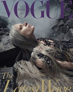
Jewellery designed, conceived and created by Kathleen Nowak Tucci (at the time marketed by her sister Margaret Nowak Dobos’ company, My Sister’s Art) was featured on the cover of the August 2010 issue of Italian Vogue magazine. The issue, called “The Latest Wave,” featured the theme of water and oil, and was styled by Karl Templer, photographed by internationally acclaimed photographer Steven Meisel, and modelled by Kristen McMenamy. The concept interpreted the environmental crisis that has been affecting the Gulf Coast. This is the first time that an eco artist’s work has been featured on the cover of a mainstream fashion magazine.

“I have always made my work in components — smaller parts of a whole work. With my rubber jewellery, it may be long triangular pieces, that I call shreds, that eventually are assembled to create to become a necklace. Strips of inner tubes wait to be connected together along with other shapes, circles triangles or flowers. I like to have many parts pre-cut out ready for whatever combination strikes my fancy.”
“I have always liked C and S curves juxtaposed against geometric shapes such as squares, circles and triangles. I feel a strongly influenced by art-deco furniture, architecture and fashion. Working with the raw material of recycled rubber allows me to make dramatic pieces with very little weight.”
However as her designs progressed and began to acquire a cohesion of her vision, her beloved Gulf Coast was hammered with the Gulf Oil Spill. She was struck with the devastation of the event, its numbing anguish, and our own human interaction with Nature, for good or ill. Tucci came to see the relevance of her work as that of an eco-artist and eco-designer. She now proudly calls herself an eco-designer, finding it fulfilling in of itself along with the simple joy of being an artist who has achieved her vision and sees the many possibilities open before her.
In 2011 Kathleen’s jewellery has been in many publications including Marie Claire, Metal Clay Artist Magazine (cover), The Linen Magazine, Coastal Lifestyle Magazine five page feature), Po10tial Magazine( cover, exocover and nine page feature).
In 2011 Kathleen’s jewellery has been in many publications including Marie Claire, Metal Clay Artist Magazine (cover), The Linen Magazine, Coastal Lifestyle Magazine five page feature), Po10tial Magazine( cover, exocover and nine page feature).

I also explored `Recycled Jewellery by Wired`
'One man's trash is another woman's treasure -especially when that trash is made into jewellery. Recycled jewellery is popping up everywhere, and the materials used to create it is just as amazing as the jewellery itself. From Industrial trash thrown away in Chicago to bicycle inner tubes in Holland, recycled jewellery is eco-chic, handmade, and planet-friendly.‘
'The light-sensitive properties of silver compounds are the key to most photographic processes, and the basis of most of the waste produced. Like the compounds of many other heavy metals, they are highly toxic, and classified as special wastes. The high value of silver has for many years provided an economic base for recycling.'
'Bold. Strong. Beautiful. Aware. (wired) jewellery and couture makes a statement. Marrying aesthetics and environment, the results empower and inspire. Founder Melissa Kolbusz designs handmade wearable artwork entirely from reclaimed and surplus industrial material. Salvaging components, such as colourful alternator wire, tubing and transistors, (wired) fashions one-of-a-kind and limited edition works with designs on the future. The colour, texture, and malleability of the found materials guide the design of each piece and foster different compositional challenges than traditional materials. 
The medium in which (wired) works is crucial in this era; recycling is not simply a buzz word, it’s essential to sustainability. (wired)’s wearable accessories and fashions are a creative design solution to counteract the waste caused by industry. By partnering with local industries, (wired) repurposes and reinvents the surplus produced by these businesses that would otherwise end up in a landfill. As individual as the wearer, each sustainable (wired) piece is a work of art, crafted locally and by hand. Purveyors can wear these works for a lifetime, knowing that they, too, are part of the solution.'

Sinnika also began exploring Futurism, and how it was launched by the Italian poet Filippo Tommaso Marinetti in 1909 with the publication of the Manifesto of Futurism on the front page of Paris newspaper Le Figaro. Drawing upon elements of Divisionism and Cubism, the Futurists created a new style that broke with old traditions and expressed the dynamism, energy and movement of their modern life.

From this knowledge I explored into Futurist painters for her. As I when researching found out that a few years later the brothers came into contact with the Italian Futurist painters (Giacomo Balla, Boccioni and Russolo) who were experimenting with how to represent movement in painting at the same time. In 1913, Anton published Fotodinamismo Futurista which captured the dynamism of movement rather than a single moment.
Giacomo Balla,
Boccioni,
Russolo


•

I did look into several double exposed photogrphers, but think she liked this artist the most.

from this researchi then wanted to explore more into surrealism. A photographer i researched was :
Salvador Dali : Bejewelled Surrealism
Jewellery designed by Salvador Dali is the hot ticket these days at auction and museums. Three major exhibits are spotlighting the jewelled versions of his surrealism this year.
“My art encompasses physics, mathematics, architecture, nuclear science – the psycho-nuclear, the mystico-nuclear – and jewellery – not paint alone,” Dali wrote in the 1959 catalogue Dalí: A Study of his Art-in-Jewels. “My jewels are a protest against emphasis upon the cost of the materials of jewellery.
“My object is to show the jeweller's art in true perspective – where the design and craftsmanship are to be valued above the material worth of the gems, as in Renaissance times.” 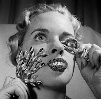
“My art encompasses physics, mathematics, architecture, nuclear science – the psycho-nuclear, the mystico-nuclear – and jewellery – not paint alone,” Dali wrote in the 1959 catalogue Dalí: A Study of his Art-in-Jewels. “My jewels are a protest against emphasis upon the cost of the materials of jewellery.
“My object is to show the jeweller's art in true perspective – where the design and craftsmanship are to be valued above the material worth of the gems, as in Renaissance times.”
Dali had everything to do with the design but little to do with the craftsmanship of his jewels. Like most Modern artists who experimented with jewellery, he relied on others for that – specifically, New York goldsmith Carlos Alemany. (, making all his jewellery by hand.)But Dali personally selected the stones: rubies to represent energy, sapphires tranquillity and lapis lazuli the subconscious mind. His early attempts produced striking, bejewelled translations of his surrealist paintings: hearts bursting open and dripping blood, eyes weeping and melting, sensuous lips.

Comments I Suggested!
- In the background, could include recyclable items to add colour creating a similar style to futuristic paintings
- Perhaps make a sculpture out of tyres ?
- Consider a portrait including jewellery ?
No comments:
Post a Comment